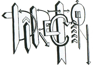
The First is Lines:
This picture represents lines, some charactoristics of some of these lines would be the difference in width, focus and feeling, the 3rd one from the bottom has that feeling because of its sharp ends. the type of lines that are shown here are sketch lines.

The Next is Direction:
This picture has a lot of vertical lines which represents the feeling of balance and alertness, it also has a couple of horizontal lines which represents calmness and tranquility and next it has two diagonal lines which represents movement and action. There are also a few with curves that represents restful and graceful.
The Next is Shape:
The following picture has your basic shapes and it's the category we call "Geometric shapes," and the different shapes show different emotions like the square, the square shows honesty, stability and equality. The circle shows infinity, protectiveness and well-roundness, and the triangles show action or conflict.
The Next is Size:
Size is simply the relationship of the are occupiied by one shape to that of another, so the following picture shows just that the "S" is the biggest and occupies the most space or area, while the "I" is the smallest and occupies the least space or area.
The Next is Texture:
This one big picture has smaller pictures in it and each shows the difference in texture. Take the first one which is the top left picture. The texture of the rocks are "real texture," thats means it is the acual texture, so the texture of this one is the surface quality which is rough and hard. The picture on the right are a smooth and soft texture, the bottom left pic is also that smooth and soft texture, while the last one is a smooth and hard texture.


I like this, because your description and pictures are really direct, good job. :)
ReplyDeleteDirect, to the point. You are all business with this. Very nice
ReplyDeleteI like the pictures you chose. Well done
ReplyDeletedescription was exactly on the point
ReplyDeleteWow.
ReplyDeleteYou were very descriptive in your pictures.
Which shows you know what your talking about.
You did a very good job. :)
You explained this well. Hats off to you!
ReplyDelete...Did you make the pictures yourself?
If so, then I appreciate the effort that went into them.
The only thing I could have wanted more was a connection to emotion. But it's still good.
ReplyDeleteyour pictures were great and almost described themselves without you having to i really liked that. excellent job
ReplyDeleteThe pictures and the elements are a very good match. Very good description as well. Excellent
ReplyDeleteNicely done :).
ReplyDeletereally good pictures and explanations. your photos explained themselves!
ReplyDelete